
Web
Dental Website Design
The best dental websites are built with a fellow dentist — and that dentist is Dr. David Wank.

At Short Hills Design we have dental website design down to a science, so potential patients can find you and become new patients!
We use WordPress exclusively so we can guarantee that with every dental website we build, we ensure that you, the dentist:
- Will own your own website, content, theme, any stock images, and all of your accounts (Google Analytics, Google Search Console, Google Business Profile).
- Can login to your dental website with administrator access at any time — after all, the site is yours!
- Can make your own changes if you'd like, and thus pay no monthly website maintenance fees.
- Can work with other marketing companies if you'd like to use multiple vendors.
Our Philosophy
Your website is the central marketing hub of your dental practice, and as such, it must be planned correctly and built to Google Webmaster standards (SEO-Ready). There are many ways to structure and build a successful website, and after years of building over 100+ websites for our clients, we know that a custom-built WordPress-based website is the ideal approach.
We Play Well with Others
Unlike most other companies, we are friendly with your other vendors. If you have us build your website and you'd like to work with us for your medical SEO needs, great! However, if you have a different SEO provider you'd like to work with, that's also no problem; we're happy to help and provide whatever information or assistance your other vendors need (with your permission, of course).
No Monthly Fees and YOU Own Your Website
No matter which provider you choose, you will have a monthly hosting fee. That being said, at Short Hills Design there are no mandatory recurring monthly fees (other than website hosting if you elect to host with us). If you need our assistance with something and we need to invoice for the time, we'll let you know; but if you don't need us, we don't bill you. And once your dental website is launched, it's 100% yours.
Our Dental Website Content is the Definition of Professional
All of our dental website packages include a selection of content from our website, contentdentist.com so you can select the content that's most relevant to you and your practice. And while we encourage you to tweak the content to the specifics of how you practice, Dr. Wank can write the content with you personally for an additional fee.
Our Websites are SEO-Ready
Lots of companies can tell you that your site is "SEO-ready" — but what does that really mean? A website that's SEO-ready has the structures in place so that if you wanted to invest in an SEO campaign later on, you won't have to rebuild your entire site.
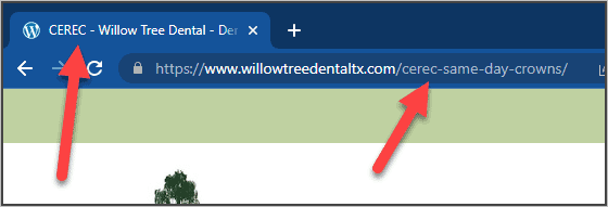
Title Tags
All web pages should have a unique title tag, and the page title in the URL should have similar text. This tells Google exactly what each page is about — and helps the right patients find you.
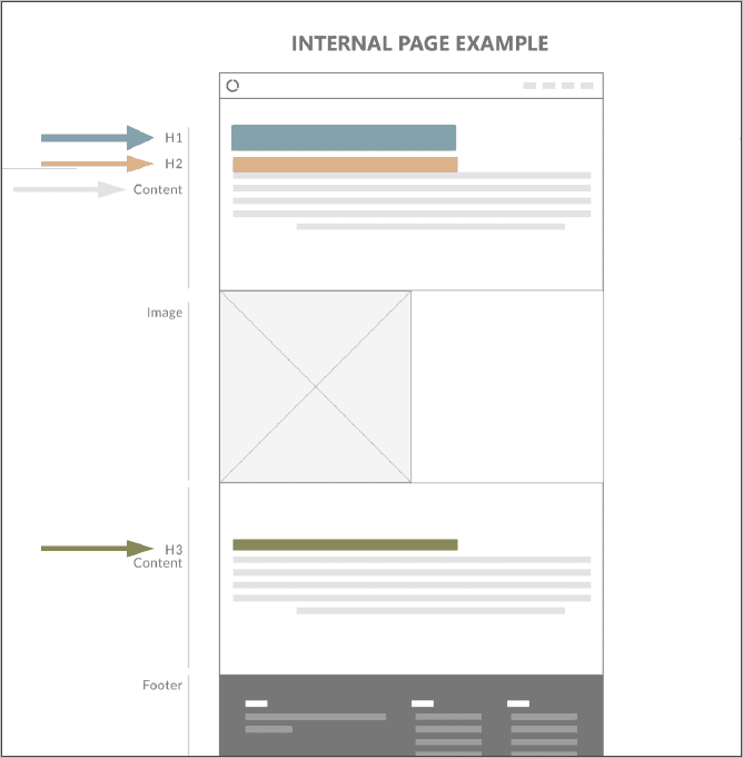
Pages Designed to SEO Standards
Web pages should be coded in HTML in "outline form" — a page has a single main title (h1) with multiple subtitles (h2) and subsections (h3) as necessary. This logical structure helps Google understand your content and helps visitors navigate your site.
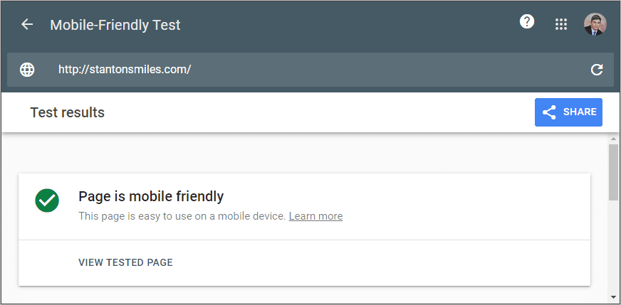
Mobile Friendly
A mobile-friendly and responsive website is critical to website success. Your visitors expect a great mobile experience, and Google lists it as a ranking factor. All of our websites pass Google's mobile-friendly test.
How Does the Dental Web Design Process Work?
- We learn from you. The first thing we do is learn from you, the client, what your goals are and what you are looking for in a new website. Think about how we as dentists approach a new patient — we know the dentistry and technical aspects of what needs to be done, but our treatment plan still must include the patient.
- We plan and design. Once we have the information from you, we start to plan out your website with you. We have a meeting to learn about you and your practice, and then start building mockups — think of the mockups like temporaries in a large case, or a wax try-in for a denture. Before we start to code the website, we get your approval of the mockups.
- We build and launch. We build your website on a private test server. It takes around 2–3 weeks to complete and you can view the site as it's being built at any time. Once complete, we do rigorous testing including mobile/tablet, speed, and loading time. With your final approval, we publish the website live, and you have a complimentary update period — just in case you find a mistake or need something tweaked.