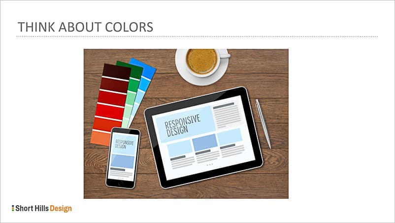
One of the most important aspects of your dental website is the way it makes people feel. And when people feel good about your website, and feel as though you are trustworthy, the higher the chance they will engage on your website. But when the colors make people nervous, scared or confused, you risk chasing potential new (and existing) patients away. In this brief post, I’m going to talk a bit about color and some best practices.
- Make sure you minimize the use of red. Red is the color of blood, and even though you aren’t going to show bloody pictures on your website, an overabundance of red can make people uncomfortable, especially since you are a dentist!
- Blue is the color of links. By convention, when people see blue text they assume that the text is “clickable” and will get frustrated if they try to click content on your website that looks like a link – but isn’t. If you must use blue, make you style and position the text to minimize the impression that it’s a clickable link.
- Consider contrast. Yellow is very hard to read on a computer monitor or smartphone, and yellow on white is almost impossible to read (yet I see it on many websites every day). Some safe combinations are black on white and dark grey on white.
- Consider culture. Purple has different cultural implications in India than is does in the United States. Make sure that if you have a large patient population from a certain culture, that you consider what the colors may mean to these patients.
- Keep colors consistent. If all of your page headings are forest green, then make sure all of them are forest green. Colors give visual cues to website visitors and if they see that all page titles are forest green, then they will be able to more easily understand the layout and structure of your page without thinking about it (which is your goal). Pick complimentary colors that work well with your logo and theme, and don’t use more than a few colors for the site; a website with too many colors or inconsistent colors reflects a sloppiness and carelessness that you do not want to relay to patients.
In summary, it’s important to remember that color is a critical factor in determining how people react to your website, and can determine what feelings people perceive when they are visiting your site. Take a look at your website now and make sure your color scheme truly reflects the message that you want to send to your visitors.