Since the beginning of June I've practically lost track of all of the dental websites I've looked at, but one major problem that I see over and over again is the navigation. So here are a few of my favorite tips (read: requirements) for making a great navigation for your website.
1) Use standard navigation titles. If you mean "meet the dr." say "meet the dr.", don't say "introductions".
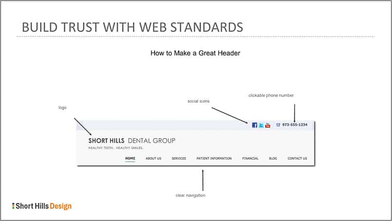
2) Use a standard order: Home, About, Services, Financial Information, Patient Resources, Blog, Contact. [Keep Home and About and Contact where they are, feel free to move the others around somewhat]
3) Make SURE there is a home button. It's fancy to leave it out because we all know to click the top-left logo to return home, correct? Wrong. I've had patients come in for denture adjustments without their dentures, so don't assume everyone knows the "logo click" convention.
4) On the subject of convention, stick with it! Don't start moving things around as doing so confuses people. And if you confuse people with the navigation, they often don't know why they are confused. Instead, they have an uneasy feeling that something isn't right, but they can't place what. (It's kind of the same feeling you get when you get someone else's cart at the supermarket by mistake). You want people to come to the site and "know what to do". Don't make people think! (n.b there's a popular web design book called just that).
5) Make sure your drop-downs (if you have them) are clean and fix into the boxes. If you need to wrap text, fine. But don't let the text come out of the drop-down box -- it looks sloppy and careless. Naturally just because your website has a small but blatant imperfection that you have chosen not to fix (or overlooked). that couldn't possibly reflect the fact in any way that you'd cement a crown with a margin that's "really close" -- or would it?
Remember, if they can't use your navigation, they can't find you!